


Building A1 DDP - Dubai Silicon Oasis
Industrial Area - 342001 -
Dubai - United Arab Emirates
+971 50 756 2346


SERVICES

COMPANY LINKS
SIGN-UP
For Newsletter


Bad design is expensive. It frustrates users, kills conversions, and damages your brand.
But the good news? There’s a way to fix it, and it starts with a proven, strategic UI/UX design process.
Whether you’re building a new digital product or redesigning an old one, this guide is for you. We’ll walk you through the exact steps top UX designers follow to turn user pain points into amazing user experiences.
From user flows and prototyping tools to usability testing and visual design, we’re covering it all.
And if you’re a CEO, founder, or creator, here’s something to think about: 94% of first impressions about your product are design-related. (1)
That’s why we’re not just talking wireframes, we’re talking about the business of design.
Let’s make sure your product is;
Easy to use.
Easy to love.
Impossible to ignore.
The UI design process is the step-by-step approach to creating the visual and interactive elements of a digital product, such as buttons, layouts, colors, and typography, to ensure users can navigate and use it easily.
It focuses on crafting intuitive, aesthetically pleasing user interfaces that align with user behavior, support usability, and reflect the brand’s identity.
The UI design process consists of several key steps, ui/ux design principles, each building toward a final product that users love and supports your business goals.
Now, let’s explore these steps in detail:
This is where every smart UI UX design process begins: with people.
Before making screens, buttons, or fancy interfaces, we first get to know the real users.
Why?
Because guessing leads to waste.
Learning leads to wins.
We start by asking: Who are we designing for? What do they really need?
To find out, we use:
All of this helps identify user goals, pain points, and common behaviors. It’s not about what we think. It’s about what real users show us
Once we’ve collected research, we summarize it into simple profiles called user personas.
Each persona represents a type of user.
It includes:
Example:
Emma, 29, is a freelance marketer. She uses mobile apps on the go. She wants to book client meetings quickly, but hates long forms.
These help the UX design teams stay user-centered and avoid designing for “everyone.”
Personas show who the user is.
User journey maps show how they move through your product.
These maps visualize the steps users take, from first interaction to task completion.
They help us:
Of course, design also needs to support your business.
That’s why we work with key stakeholders: founders, marketers, and developers, to:
This step sets the direction for the rest of the design process.
All of this research leads to a clear statement like:
“Busy professionals need a faster way to track expenses during travel.”
That’s called a problem statement or design brief. It keeps everyone aligned and focused.
Without this step, teams often build pretty things… that no one uses.
Next up: We'll take these insights and begin shaping the structure of your app or website, starting with information architecture and user flows.
Now that we know who our users are, it’s time to organize the experience.
In this step, we answer:
“Where does everything go?”
“How will users interact with it?”
To do that, we create smart structures and flows that feel natural, not confusing.
This phase includes:
1. Information architecture - Organize Everything
2. User Flows - Map the Journey
3. Wireframe sketches - Visualize Ideas
It helps the design team build a foundation before jumping into visuals.
Think of IA like a map for your website or app.
It helps organize pages, content, and features in a way that’s easy to understand. If things are buried or hard to find, users will leave fast.
So, we build:
This step improves the user interface by making it logical.
It also enables designers to plan content layout and connections.
💡 Good IA = better usability and faster user decisions.
Next, we sketch user flows.
A user flow is a step-by-step path someone takes to complete a task, like signing up or making a purchase.
Each flow starts at a point like ‘Home’ and ends at a goal like ‘Checkout Complete’.
These flows help us:
Example user flow:
These are used by both UX designers and UI designers to create smoother navigation.
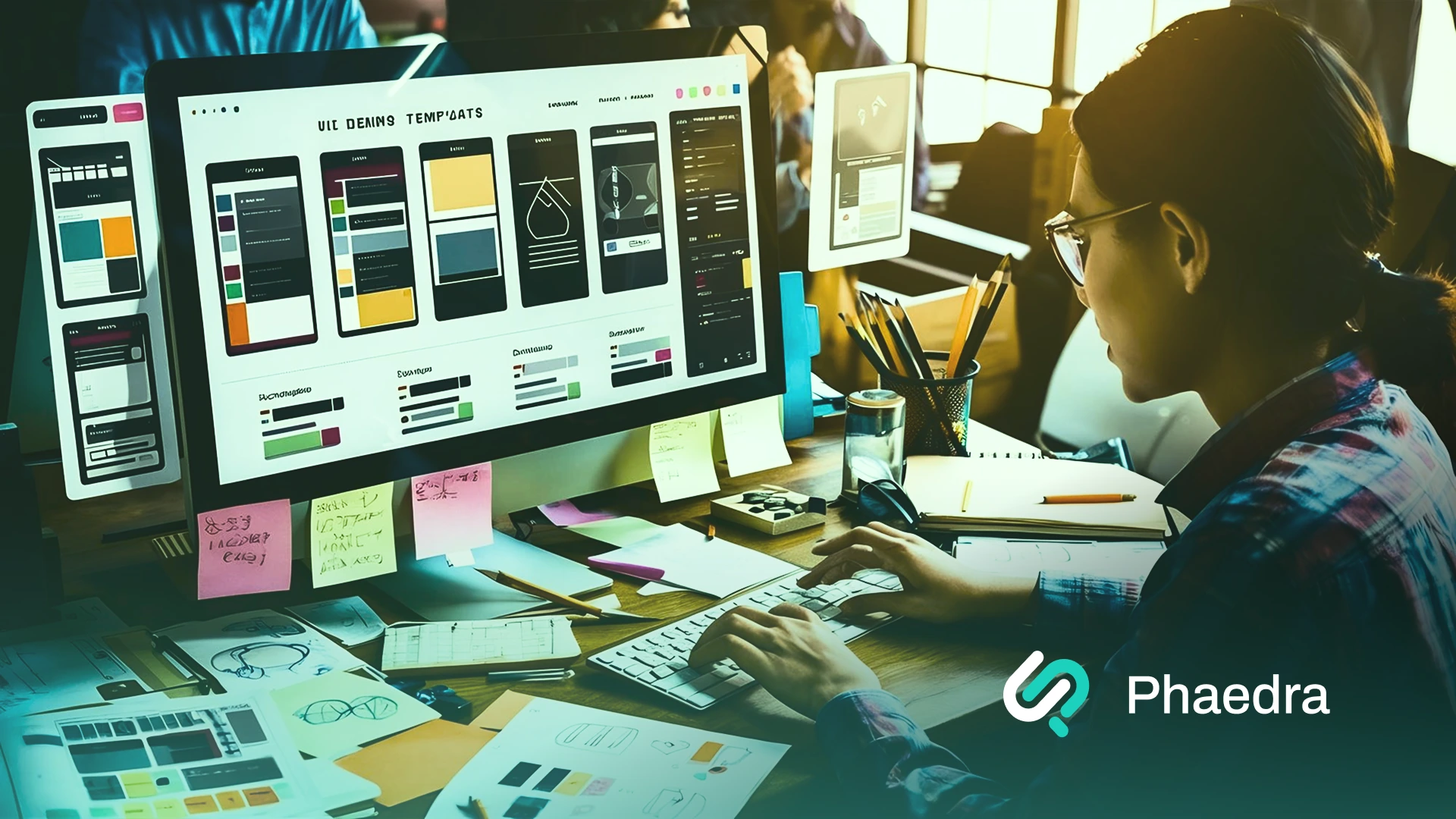
Now that we have structure and flows, it’s time to visualize ideas.
We start by creating wireframes: simple black-and-white sketches of screens.
These focus on layout, not colors or branding.
Wireframes include:
We keep them low-fidelity at this stage. That way, it’s easy to change things.
You can sketch them by hand, use whiteboards, or go digital with tools like:
This early prototyping phase allows fast feedback without wasting time on a polished design.
Design teams often do IA and wireframes side-by-side. It helps align the UI design process with the real product structure.
To stay efficient:
Many UI designers rely on this step to avoid rework later.
This is where structure meets purpose.
It’s the blueprint phase of the UX design process; the stage where good product experience planning consultation leads to a better final design.
If this part is skipped or rushed:
But when done well?
It creates an easy-to-use interface that users love, and that supports your business goals too.
Up Next: Let’s turn these wireframes into working interactive prototypes and get ready for testing.
Now that we’ve organized the experience, it’s time to bring it to life.
This step turns your rough wireframes into something users can click, tap, and test, all before writing a single line of code.
We call this prototyping, and it’s one of the most important parts of the UI UX design process.
The 3 Main Parts of This Step:
Let’s walk through each part.
We begin by creating wireframes: the layout of each screen.
At first, we keep them basic.
Black, white, and grey.
No colors.
No logos.
Why?
Because at this point, we care about structure, not style.
These low-fidelity wireframes help us:
Once the structure feels solid, we upgrade to high-fidelity wireframes.
Here, we add spacing, fonts, images, and placeholder content. It starts to look more like a real app or website.
Common UI design tools for wireframes:
These tools help UI designers move from sketches to screens in no time.
A wireframe shows what a screen looks like.
A prototype shows how it works.
With tools like Figma, InVision, or Axure, we can connect screens with buttons, links, and transitions.
This creates a real, clickable experience called an interactive prototype.
It simulates how users interact with the product before anything is coded.
Prototypes help us:
Bonus: You can even test mobile apps with digital prototypes on real phones.
Now comes the most valuable part: usability testing.
Even at the prototype stage, we invite real users to try the design, as you can see in our process-driven case studies.
They click around. Try tasks. Give feedback.
And often… get stuck.
That’s gold.
We learn what confuses people, what’s working, and what needs to change.
Use user testing tools like:
Then repeat the cycle:
Test → Feedback → Fix → Test Again
This iterative design process helps UX designers solve problems before development begins.
This is the bridge between ideas and reality.
By prototyping early and testing fast, we:
It also sets the tone for the final product; visually, structurally, and experientially.
Next Up: We’ll take our tested prototype and polish the visuals: colors, branding, and UI elements, to get it launch-ready.
Now it’s time to make it look amazing.
In this step, we take the tested prototype and turn it into a final design that’s clean, beautiful, and totally on-brand.
We focus on:
This is where the UI design process really comes alive.
The 4 Key Parts of This Step:
Let’s walk through each one.
First, we build a design system. Think of it like a visual rulebook.
It includes:
This helps maintain consistency across your user interface.
When everything follows the same rules, your product feels clean and professional.
When it doesn’t? It looks messy, and users get confused.
Next, we make sure your product matches your brand identity.
A health app might use soft blues and clean fonts. A sports brand might go bold with sharp edges and bright colors.
This part is all about aligning with your:
When the visual elements match the brand, users trust your product more.
Good branding = Good first impression.
Now we polish everything into high-fidelity mockups. These are the final, production-ready screens.
Here’s what we focus on:
This is where UI designers really bring the product to life.
We also check that all screens reflect the real user flows and that the layout supports the content, not the other way around.
More than 50% of users are on mobile. That means responsive design isn’t optional.
It’s essential.
We make sure:
This includes testing on:
And yes, we always test real devices, not just in Figma.
This step turns your prototype into the final product.
It’s not just about making it pretty. It’s about clarity, trust, and professionalism.
When a user opens your product, the design should make them feel:
That’s what great UI design does.
Next Up: We’ll test everything with real users, collect feedback, and refine before launch.
Your design looks great. But will real users understand how to use it?
This step helps us find out.
We test the product with real people. Then we make changes to fix what’s not working.
It’s called usability testing, and it’s a key part of the UI UX design process.
The 4 Key Parts of This Step:
We give real users a clickable prototype or early version of the product.
Then we ask them to complete simple tasks, like:
We watch how they interact with the interface.
What we’re looking for:
Even testing with just 5–7 users can reveal most usability issues.
That’s because real behavior shows us what no amount of guessing ever could.
After the test, we ask questions or look at analytics.
Here are some things we track:
And here’s why it matters:
74% of visitors may come back to the website only if it has a good mobile UX. (2)
That’s the power of user-centered design.
Now we make changes.
Sometimes it’s small:
Other times, we revise layouts or even full user flows.
Then we test again.
This iterative design process continues until users can complete tasks easily and with confidence.
The goal?
Smooth UX. Happy users. Better results.
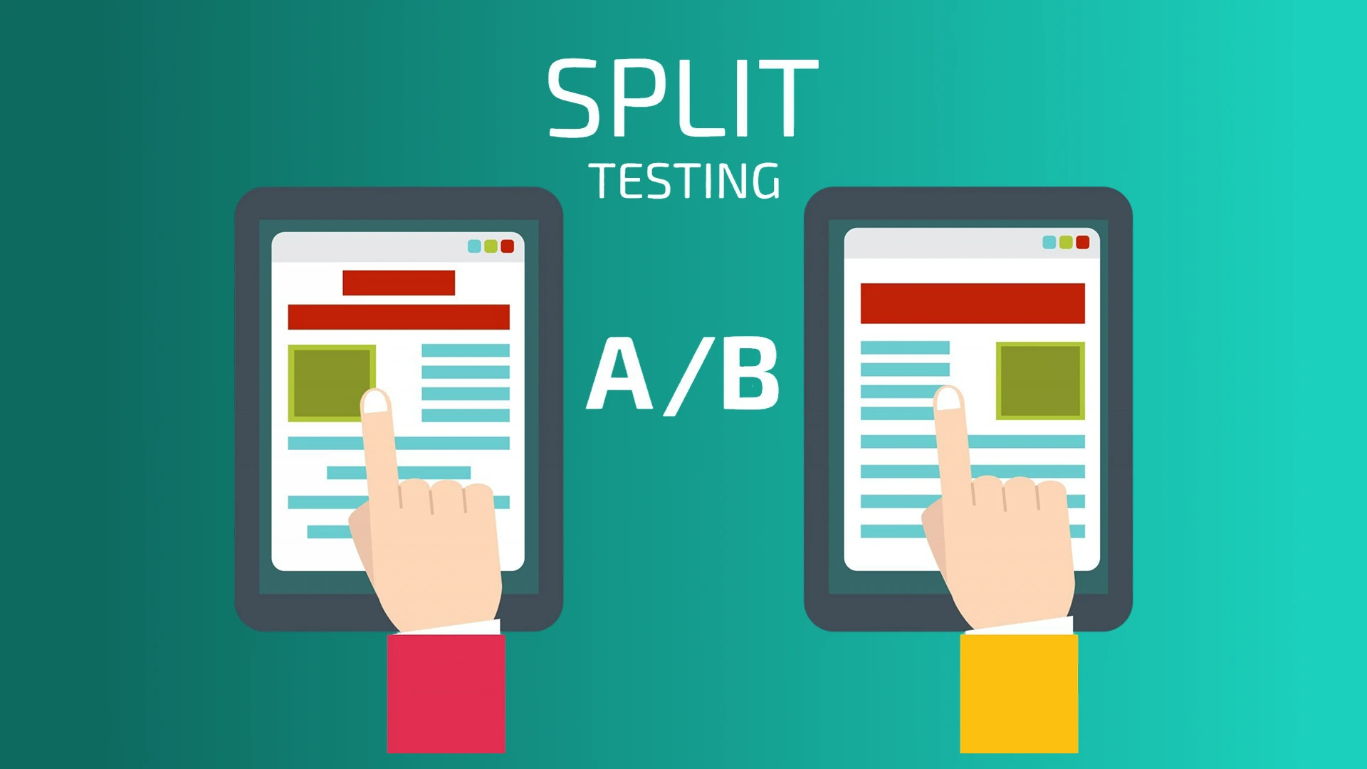
For live products, we might try A/B testing.
That means showing two versions of a page to different users to see which one performs better.
Example:
We track clicks, conversions, or time spent.
This is a great way to improve without guessing.
Testing helps you move from “looks good” to “works great.”
It proves that your UI design is clear, that your flows make sense, and that your digital product is ready to launch.
And it can have huge results. Research shows:
That’s why testing isn’t extra, it’s essential.
Next Up: We’ll get your validated design ready for development and launch.
You’ve tested. You’ve refined. Now it’s time to build and launch the final product.
This step connects the design team with the development team. Together, they turn your polished UI into a working, live product.
But the UI UX design process doesn’t stop at launch.
Smart teams monitor, measure, and improve, always.
The 4 Key Parts of This Step:
Let’s begin!
Designs don’t just sit pretty; they need to be built.
That’s why we prepare all files and assets with care:
We use tools like:
1. Figma - with built-in dev mode
2. Zeplin - for easy CSS-ready specs
3. Adobe XD - with style guides and handoff features
These tools help UI designers and developers stay on the same page.
A good handoff saves hours of back-and-forth.
Even with specs in place, designers don’t just “hand it off and disappear.”
We stay involved.
The goal? A UI that looks and feels just like the design, even across all screen sizes.
It’s about delivering a user interface that’s not just beautiful but works flawlessly.
With everything built, tested, and reviewed, it’s time to launch.
But don’t hit publish and walk away.
Use tools like:
These help track user behavior and usability issues after launch.
You can also gather user feedback through:
This is part of an end-to-end UI UX design approach, where design continues after the product goes live.
The best products keep evolving.
After launch, we:
Many companies hire product design consulting firms here to review and improve based on market data.
Remember, your UI isn’t ever “done.” There’s always room to make it more intuitive, more enjoyable, and more aligned with user needs.
This is where your idea becomes real.
It’s the final link between UI design, engineering, and business results.
Done right, you get:
It’s also where you see the return on your UI UX design cost because now you’re live, learning, and improving every day.
Now it’s time to zoom out and connect the entire UI/UX design process to what matters most: real business results.
You’ve seen the full UI UX design process.
Now let’s step back and look at the big picture: why does all of this matter for your business?
Design isn’t just about visuals. It’s about outcomes.
Better UX means better results.
The 4 Big Focus Areas:
Let’s go over these more thoroughly now.
Design without a goal is just decoration.
We connect each UI design decision to a business metric:
By linking screens to conversion rates, user satisfaction, or brand perception, we turn ideas into results.
If you can measure it, you can improve it.
This is how you turn the design process into ROI.
Your CEO, marketer, or product lead shouldn’t just review designs at the end.
Bring them in early. Let them:
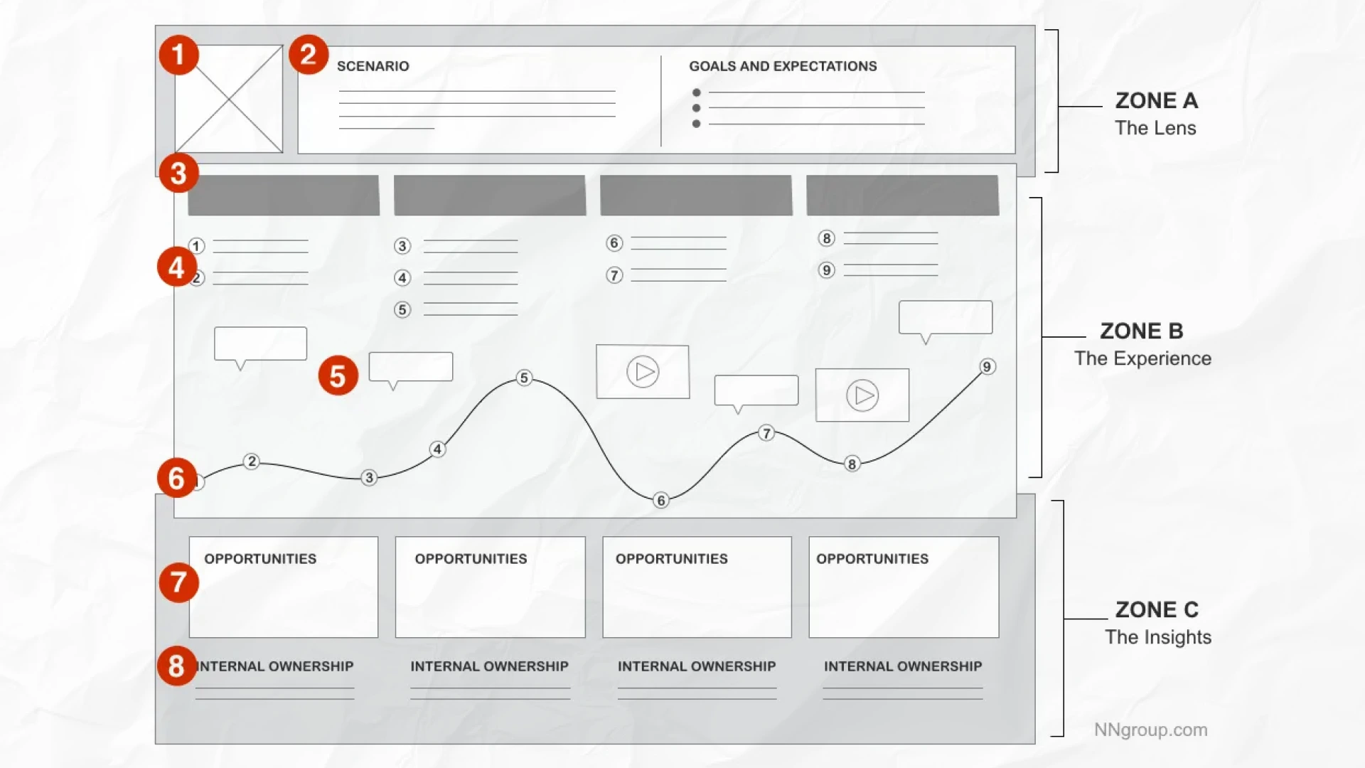
According to NN Group, when leaders see users struggle, they immediately understand the value of UX and are more likely to support it. (4)
These people are your key stakeholders. When they believe in the product, it moves faster, gets more budget, and succeeds.
Your final product should feel like part of your brand, not something random.
That means keeping your:
…aligned across all platforms.
Using a style guide or design system helps UI designers maintain consistency as the product grows.
When your app and site match, people trust you more. That trust leads to stronger loyalty and more conversions.
Going live doesn’t mean you’re done.
In fact, that’s when the real learning begins.
After launch, track:
Then improve. Run A/B tests. Test new user flows. Fix usability issues.
Even small changes like a clearer button can boost conversions significantly.
This is the power of data-driven, user-centered design thinking.
Great teams treat UX as a continuous loop, not a one-time task.
The UX design process is important, not just for usability, but for business success.
By aligning your UI/UX work with business strategy, you:
It’s not about making things look good. It’s about making them work better for your users and your business.
Here’s a table summarizing the key areas we discussed above:
Design is more than creativity; it’s about using the right tools, following smart practices, and working as one team.
Let’s wrap up the UI UX design process with three areas that help teams stay efficient, consistent, and user-focused.
The right tools make the design process faster and more collaborative.
Here are the most commonly used tools by UI designers and UX design teams:
These tools support full end-to-end UI UX design workflows, from low-fidelity layouts to high-fidelity prototypes.
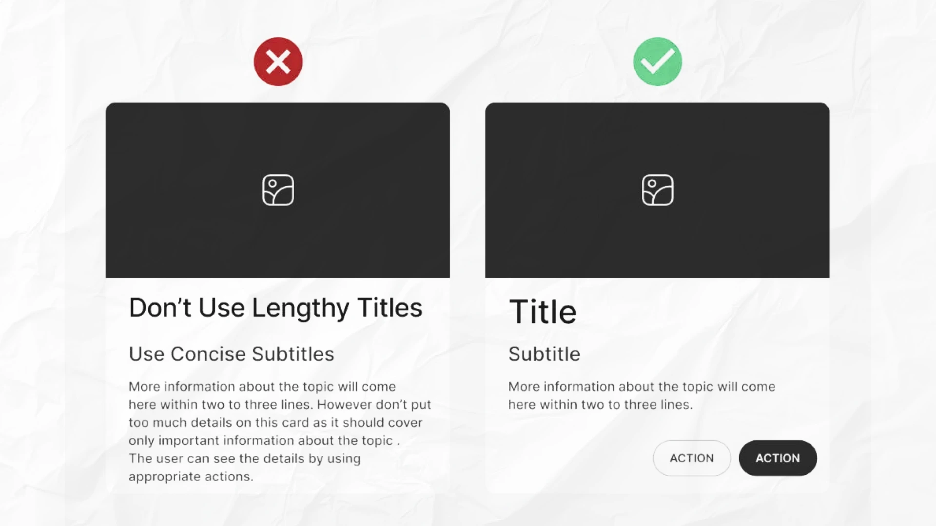
No matter what tools you use, these tips will improve your user interface and experience:
Great design isn’t based on opinions; it’s based on user behavior.
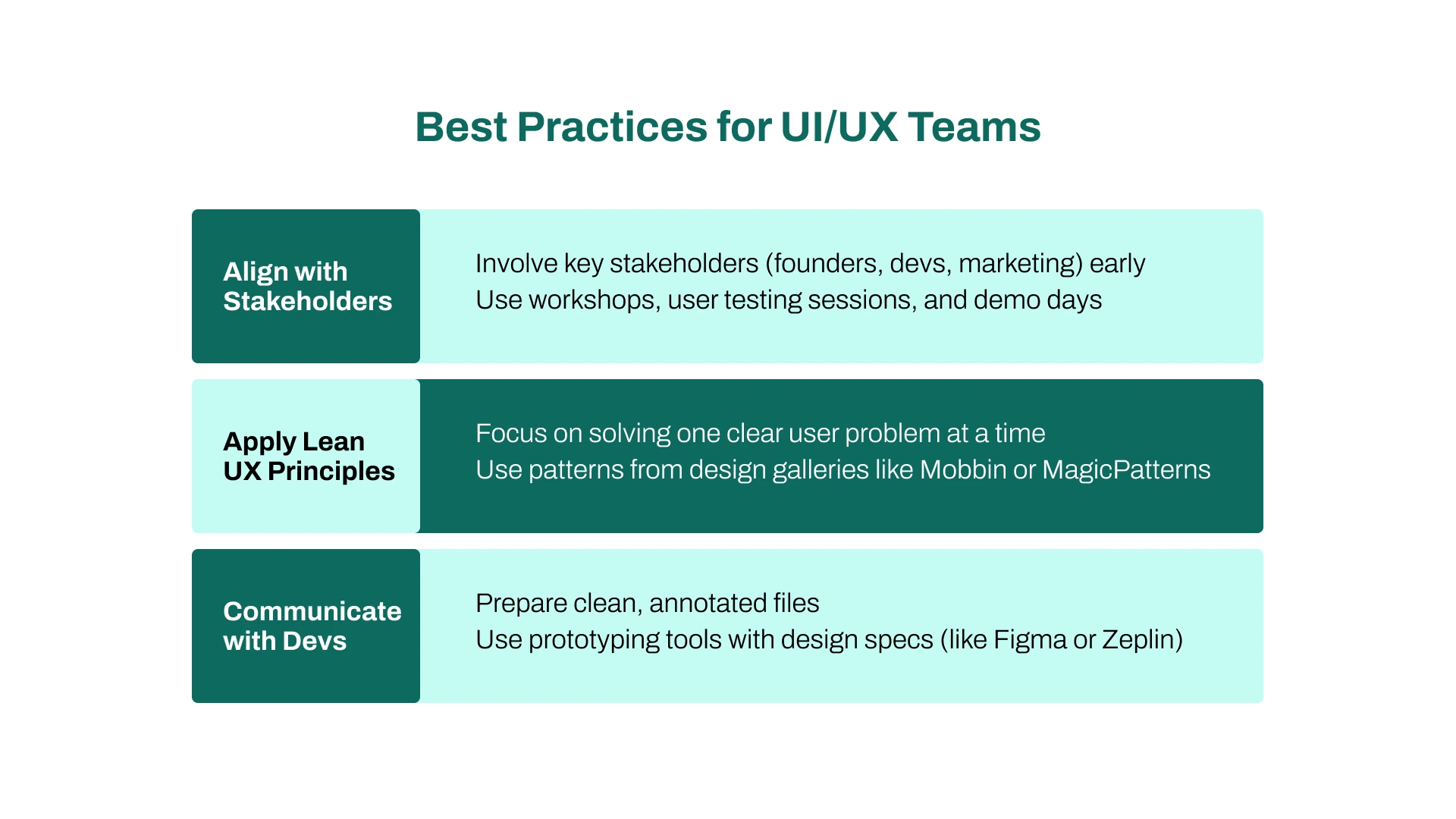
Design doesn’t happen in a bubble. It takes cross-functional collaboration.
Here’s how to make it work better for everyone:
`1. Align with Stakeholders
2. Apply Lean UX Principles
This is especially helpful for startups that need to move fast.
3. Communicate with Devs
The tools, tips, and practices you choose don’t just make your work easier; they shape the entire product. They affect how fast you move, how well your team collaborates, and how consistently your user interface holds up across features and platforms.
Great tools save you time. Smart systems help you maintain consistency. And clear processes lead to smoother user flows and better handoffs between teams.
But it’s not just about speed. It’s about experience: creating something real users enjoy using.
At the end of the day, great UI UX design means balancing creativity with structure. It’s about getting the details right, without losing sight of the people you’re building for.
Even with the best tools and processes, teams run into mistakes.
Here are the most common UI/UX slip-ups, and how to fix them before they cost you time, users, or revenue.
What We'll Cover:
This is a big one. And it happens a lot.
Teams focus on pretty visuals without talking to real users. But when you skip user research, you’re just guessing.
What can go wrong?
Fix it:
Mixing fonts, switching colors, and ignoring spacing rules? That leads to a confusing and unprofessional user interface.
And confused users don’t convert.
What can go wrong?
Fix it:
It’s tempting to make everything perfect before launch. But that’s a trap, especially for startups.
What can go wrong?
Fix it:
This is how real-world UX designers think, especially in early stages.
More than 50% of traffic is mobile. And users expect speed.
If your app loads slowly or buttons are hard to tap? They’re gone.
What can go wrong?
Fix it:
Even the best designs fall apart if the development team doesn’t understand them.
Bad handoff = bad product.
What can go wrong?
Fix it:
It’s easy to fall in love with features. But if they don’t solve a real problem or fit your brand, they’re useless.
What can go wrong?
Fix it:
Let’s summarise these common pitfalls and their solutions:
The UI UX design process isn’t just about what you do; it’s also about what you avoid.
By spotting these common mistakes early, your team can design smarter, faster, and with more confidence.
The UI/UX design process isn’t just a checklist; it’s a roadmap for creating digital products users actually want. From research to launch, each step keeps you aligned with your target audience, focused on outcomes, and clear on business goals.
Great UI design goes beyond visuals. When users succeed, your product grows. That’s why top teams involve UX designers, decision-makers, and key stakeholders early on.


Areesha is a content writer with over 2 years of experience in writing about tech and digital trends. She focuses on topics like AI, remote work, and productivity.
Her blogs have helped startups grow their content reach and improve lead generation. She writes with a focus on clarity, simplicity, and reader value.