


Building A1 DDP - Dubai Silicon Oasis
Industrial Area - 342001 -
Dubai - United Arab Emirates
+971 50 756 2346


SERVICES

COMPANY LINKS
SIGN-UP
For Newsletter


If you’re here, it’s likely because you’ve felt the frustration: Users dropping off halfway through your user flow, confusion caused by inconsistent visual design, and complaints about interfaces that feel clunky or overwhelming
Today’s users demand digital experiences that are fast, intuitive, and designed around their needs.
That’s why UX design principles are the backbone of any successful UX design process.
These principles help your teams design with clarity, avoid usability issues, and build products that align with users’ mental models and existing knowledge.
They’re the difference between a product users tolerate and one they love.
Consider this: 88% of users won’t return after a bad digital experience (1). That’s a risk none of us is willing to take.
UX design principles are simple rules or guidelines that help us build digital products that feel easy, useful, and even delightful to use.
These principles shape how we design user interfaces, choose colors and layouts, and organize features so users can move smoothly through a user flow without getting lost.
Think of them like a recipe for creating great user experiences.
Even the best UX designers don’t just rely on gut feeling.
They use design principles to help:
These rules help product teams make choices that save time, avoid usability issues, and build trust with real users.
UX design principles aren’t just for beginners learning what is UX design. Even experienced pros revisit them because:
No matter how skilled you are, these key principles keep your work grounded in what users expect and need.
Great design is a competitive advantage.
When you use UX design principles well, you’re not just making screens look pretty. You’re:
At the heart of it all is one idea: user-centered design, which involves learning about your target users through user research, testing designs with usability testing and gathering user feedback, designing for real-life challenges, like visual impairments or different devices, as well as speaking in plain language, not internal jargon.
If you keep the user at the center of every decision, you’re already applying the most important UX principles.
Creating great user experiences doesn’t happen by accident.
It takes a solid set of UX design principles that guide every choice, from the smallest button style to the entire user flow. These principles help UX designers keep products user-centered, avoid usability issues, and build designs that feel smooth and natural to real users.
Here’s an overview of the 15 key principles we’ll explore in depth. Think of them as your blueprint for creating products that people love:
Here’s a handy table summarizing all 15 principles, with practical examples you can apply to your next project:
Together, these principles are the backbone of effective ux design. They help your design teams create interfaces that are not just pretty, but smart, practical, and loved by your target users.
Let’s explore each principle one by one.

The first and most important UX design principle is this: Design for real people.
This is called user-centered design. It means every decision you make should start with your users’ needs, feelings, and real-life situations.
It’s not just about making screens look pretty. It’s about creating digital products that truly solve problems and fit into people’s daily lives.
User-centered design is all about putting users first. Here’s how:
When you do this, you’re far more likely to create engaging user experiences that people love and keep using.
On the other hand, when you ignore what real users need, your designs can feel confusing or frustrating.
Worse, users might leave and never come back.
Companies that invest in UX see a lower cost of customer acquisition and 2x higher customer retention. (2)
That’s why user-centered design isn’t just a feel-good idea. It’s a smart business move. It can be your competitive edge in crowded markets where every user experience counts.
User-Centered Design Helps You:

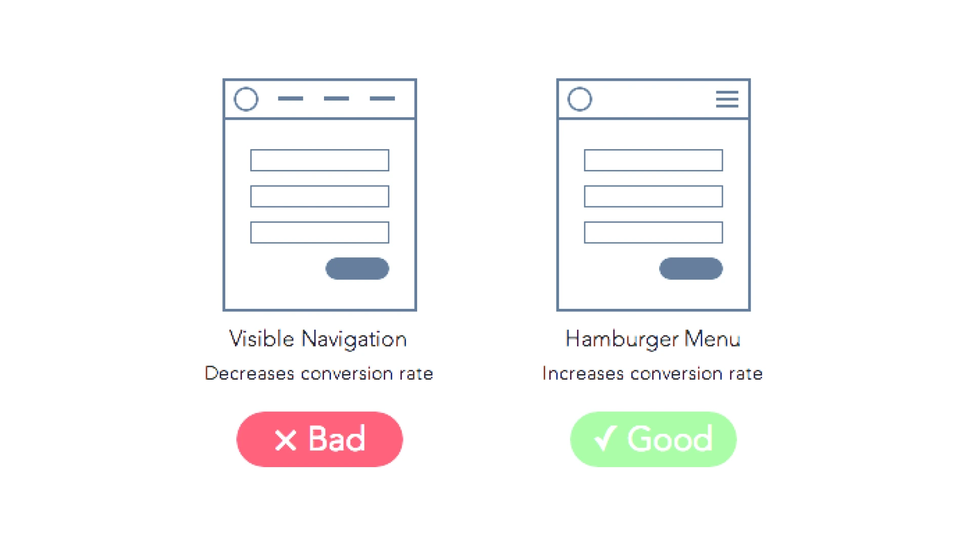
Imagine using an app where every screen looks completely different.
Colors change. Buttons move around. Icons mean different things in different places.
That’s a recipe for confusion, and it’s why one of the most important UX design principles is to maintain consistency across all parts of your user interface.
When you keep things consistent, your users:
Good UX design is about helping users feel at home, whether they’re on a website, a mobile app, or any other screen.
UX designers use consistency in many ways. For example:
These small details add up to create smooth, engaging user experiences.
Look at Slack.
Slack uses the same color palette, icons, and layout across both web and mobile apps. This helps users switch between devices without feeling lost or confused.
That’s a perfect example of how to maintain consistency to support great user experiences.
Consistency also makes your product:
Ultimately, a consistent product reduces the cognitive load for users.

Nobody likes feeling trapped.
Especially not in a digital product where a single wrong click can feel like there’s no way back.
That’s why one of the most powerful UX design principles is giving users control and freedom. It helps build trust and makes the user experience feel safer and more pleasant.
When users feel in charge, they:
This freedom is what turns an average app into one that people genuinely enjoy using. It’s a big part of creating great user experiences.
Here’s how UX designers build user control into their products:
1. Add an Undo button so users can easily reverse actions
2. Let users cancel a task at any time
3. Design workflows that allow reversible steps instead of forcing permanent choices right away
4. Provide clear paths for going back, like breadcrumb navigation or back buttons
These small touches lower cognitive load and make it easier for users to navigate your product without fear.
Think about Gmail’s “Undo Send” feature.
After hitting "Send," Gmail gives you a few seconds to cancel the email from being sent. It’s a perfect real-world example of user control, saving users from embarrassing mistakes and making them feel safer using the platform.
Providing user control isn’t just beneficial for users; it’s also beneficial for businesses. It helps you:

Imagine clicking a button and… nothing happens.
No spinning icon. No message. Just silence.
That’s one of the fastest ways to make users feel confused or, worse, lose trust in your product.
A crucial UX design principle is always keeping users informed of the system status. People want to know what’s happening so they feel in control and confident using your digital products.
A good user experience depends on clear communication. When users know what the system is doing, they’re:
That’s a huge achievement for any business looking to create great user experiences and maintain a competitive edge.
Here’s how UX designers keep people in the loop:
These simple signs give users confidence, reduce cognitive load, and help them understand where they are in the user flow.
Think about how online checkouts show each step, from adding items to payment and confirmation.
Or how Google Docs tells you, “All changes saved in Drive.”
These are perfect real-world examples of showing system status so users always feel informed and in control.
When you keep users informed about what’s happening:

Our brains can only handle so much at once.
When your user interface throws too much at people, it overwhelms them, and that’s when frustration sets in.
A core UX design principle is to reduce cognitive load so your designs feel simple, clean, and easy to use.
Think of cognitive load like mental clutter. It’s how much mental effort it takes for users to:
Our working memory, the part of the brain that holds temporary information, can only juggle about 3–5 pieces of information at once.
If you overload it, users get confused or abandon tasks altogether.
UX designers use these tricks to lighten the load:
All these tactics help users navigate your product smoothly and avoid feeling lost.
Apple is a master at this.
Their minimalist designs focus on one key action per screen. Buttons are spaced out. The text is clear and short. Apple understands that reducing cognitive load is key to creating great user experiences that feel effortless.
When you reduce mental clutter:
It’s a smart move for both user-centered design and business success.
Curious how to simplify your products?

People don’t show up to your app or website with a blank slate.
They carry their life experiences, habits, and expectations into every user experience.
These invisible expectations are called mental models, and they’re a huge reason why matching them is one of the most important UX design principles.
A mental model is simply how users expect things to work based on what they already know.
For example:
These models help users quickly navigate new user interfaces because they connect to familiar patterns.
When your digital product matches users’ mental models, it:
1. Feels easier and more comfortable to use
2. Requires less learning, reducing cognitive load
3. Helps people feel smart and in control
4. Makes your product feel user-centered rather than random or confusing
But if your design goes against what users expect, it can quickly cause frustration or mistakes.
UX designers keep mental models in mind by:
This approach helps ensure your product fits smoothly into the mental “map” users already carry in their heads.
Think about digital shopping carts.
The idea comes straight from real-life grocery stores.
Putting items in a virtual cart feels natural because it matches how users already shop in the physical world. It’s a perfect example of aligning with users’ mental models to create great user experiences.
When your product matches users’ existing knowledge and expectations:

Our brains are amazing, but they’re not built to remember everything.
Especially when we’re staring at a busy user interface, trying to figure out where to go next.
One of the smartest UX design principles is to minimize users’ memory load. That means designing so people don’t have to keep lots of details in their heads just to get things done.
Here’s the truth:
Most people’s working memory can only hold a few bits of information at once.
If your product forces users to remember long instructions, hidden steps, or complex pathways, it’s easy for them to get lost or give up.
Reducing cognitive load helps users feel calm and in control, instead of overwhelmed.
UX designers use several tactics to help keep memory demands low:
These techniques help users stay focused and avoid errors in their user flow.
Think about search bars that suggest words as you type.
Or apps that keep showing your progress in the corner so you don’t have to remember how many steps are left.
These are real-world examples of helping users by keeping information visible and easy to access.
When you minimize users’ memory load, you make your product:
It’s a key way to create great user experiences that people appreciate and return to.
Ever land on a webpage and wonder: “Where should I look first?”
When everything on a screen shouts for attention, users feel lost and overwhelmed.
A crucial UX design principle is to create a clear visual hierarchy so users know exactly where to focus.
Visual hierarchy means arranging design elements to show what’s most important.
It’s how you guide users’ eyes and help them quickly understand how to navigate your user interface. Think of it like a map for the eyes.
It’s one of the key ways UX designers build engaging user experiences.
Here’s how you can build a strong hierarchy in your visual design:
Look at Airbnb’s website.
Their strong headers, clean layouts, and standout call-to-action buttons make it obvious where users should look and click next.
It’s a perfect real-world example of how smart visual hierarchy creates a smooth user experience.
When your digital product has a clear hierarchy, you:
It’s essential for both user-centered design and business success.

Ever tried using a website where every click feels like a dead end? Or where it takes five confusing steps to do one simple task?
That’s why a key UX design principle is guiding users through a smooth, logical user flow.
A user flow is the path a person takes to get something done in your digital product.
It’s the journey from start to finish, like going from signing up for an account to making a purchase.
A good flow feels natural and helps users navigate without second-guessing where to go next.
When your product has a clear user flow, you help users:
Confusing flows, on the other hand, create friction and increase cognitive load.
Here’s how UX designers keep flows smooth and logical:
These steps help ensure that your user experience feels effortless instead of frustrating.
Think of online shopping checkouts.
Great e-commerce sites guide you step by step: cart, shipping, payment, and confirmation.
Each screen leads smoothly to the next, helping users complete their goal without confusion.
That’s a perfect real-world example of a strong user flow.
Creating a logical user flow helps you:

Everyone makes mistakes.
But great UX design helps people avoid those mistakes, or at least fix them quickly.
One of the smartest UX design principles is to allow users to avoid errors in the first place. It keeps your product feeling safe, smooth, and user-centered.
Mistakes frustrate users, waste time, and can even cause people to abandon your digital products altogether.
Good design helps users avoid mistakes, especially in error-prone conditions, like filling out forms or deleting important files.
Keeping errors low reduces stress and builds trust in your user experience.
UX designers use several tricks to keep errors to a minimum:
All these steps make it easier for users to stay in control and avoid mistakes.
Think about Dropbox.
When you try to delete a folder, it doesn’t just vanish.
Dropbox shows a message asking, “Are you sure you want to delete this?”
It’s a perfect real-world example of helping users avoid mistakes before they become big problems.
When your product helps users avoid errors:

Imagine opening an app and seeing this message:
“Initiate Media Asset Transfer.”
Confusing, right?
A key UX design principle is to speak in plain language that your users actually understand, not internal jargon only your team knows.
Clear, simple language:
Users want quick answers and easy instructions, not words that sound like legal contracts.
Here’s how UX designers keep it simple and clear:
1. Use everyday words instead of technical terms
2. Write labels that match what users expect
3. Avoid long sentences and complex phrases
4. Test your words with user research to see if people understand them
5. Replace internal jargon with simple, helpful terms
6. Make sure language works for all reading levels and for people with visual impairments who might use screen readers
These steps keep your user experience clean and easy to navigate.
Instead of saying:
“Initiate Media Asset Transfer”
Say:
“Upload Photo.”
It’s shorter, clearer, and exactly what users want to do.
That’s a perfect real-world example of how using plain language helps create great user experiences.
Using the language your target users know and love:
It’s one of the simplest ways to gain a competitive edge in your market.

Imagine pressing a button and… nothing happens.
Or filling out a form and wondering if it went through.
One of the most crucial UX design principles is to provide helpful feedback and guidance so users always feel confident and informed during their journey.
Feedback is your way of talking back to the user.
It lets people know:
Without feedback, users feel lost, frustrated, or out of control. All these things hurt your user experience.
Here’s how UX designers make sure users always feel informed:
Good feedback reduces cognitive load and helps users feel in control of the user interface.
Think about filling out a signup form.
A good design shows an error message instantly if your email address is missing the “@” symbol.
Or consider apps that say “Upload successful!” after adding a file.
These are perfect real-world examples of feedback keeping users informed and confident.
Providing helpful feedback leads to:
It’s a simple way to make your product feel thoughtful and user-centered.

Great design isn’t just for some people; it’s for everyone.
A vital UX design principle is to design for accessibility and diverse user needs so that every person can enjoy your product, no matter their abilities.
It’s not only the right thing to do, it’s also smart business.
Here’s a powerful fact: 1 in 4 adults in the U.S. lives with a disability. (3)
Ignoring accessibility means leaving out millions of real users who want and deserve equal access to your digital products.
Designing for everyone helps you create great user experiences and gives your brand a competitive edge.
UX designers follow several important steps to keep products inclusive:
These steps make products more user-centered and welcoming to all.
Think of a website that allows users to resize text without breaking the layout.
Or a form that labels fields clearly so screen readers can announce them correctly.
These are excellent real-world examples of how small choices help create engaging user experiences for everyone.
When you design with accessibility in mind:

People learn best when they can connect new ideas to things they already know.
That’s why a smart UX design principle is to provide real-world examples to help users quickly understand how your digital products work.
It’s a simple but powerful way to make your designs more user-centered and engaging.
When you show familiar examples:
Here’s how UX designers bring examples into their work:
Good examples bridge the gap between complex tech and the way users naturally think and act.
Here are a couple of great real-world examples:
1. Amazon’s “Saved for Later”
Instead of forcing users to delete items from their cart, Amazon lets them save products for future shopping. It’s just like putting things back on the shelf in a real store.
2. Netflix’s auto-play previews
When users hover over a show, a short video starts playing. This mimics how people flip through TV channels to get a feel for what’s on.
These examples help users feel at home and navigate digital spaces more confidently.
When you use relatable examples, you help:

Even the best UX designers can’t predict everything.
That’s why one of the most powerful UX design principles is simple: Test, measure, and keep improving.
Design is never “done”. Great user experiences come from constant learning and refinement.
Here’s the truth:
We all have ideas and assumptions about what users want. But unless we check those ideas, we’re just guessing.
Every $1 invested in UX brings $100 in return. (4)
Testing and iterating isn’t just good design; it’s smart business that can give you a huge competitive edge.
UX designers rely on several tools and tactics to keep products evolving:
These steps help create products that are truly user-centered and aligned with user needs.
Think about companies like Amazon or Netflix.
They’re always running A/B tests to see which layouts, buttons, or features keep users engaged.
That’s how they stay ahead and consistently create great user experiences.
When you keep testing and iterating:
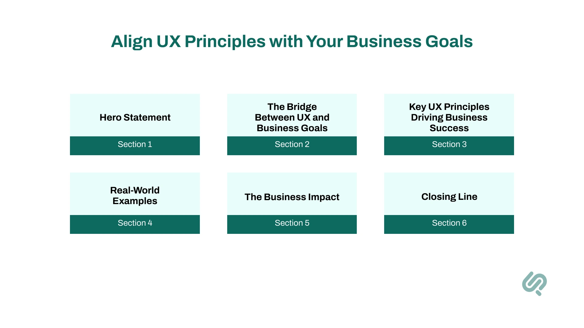
Great UX design isn’t just about how things look. It’s about connecting every screen, feature, and piece of content to your business goals.
Whether you’re aiming to increase sales, lower support costs, or build trust, strong UX design principles help you get there. Good design turns products from a collection of features into powerful tools for growth.
Smart businesses know that reducing cognitive load helps users finish tasks faster, leading to fewer drop-offs and more sales. Keeping consistency across your user interface builds trust and makes your brand look professional. And giving users control prevents mistakes and saves time for both customers and teams.
These aren’t just extras; they’re crucial for gaining a real competitive edge.
Look at Amazon and Apple.
Their products feel clean, simple, and focused. But it’s more than beauty; they’re creating products that solve real problems and drive business results. Everything connects back to goals like higher conversions and loyal customers.
When you align UX principles with business goals, your product becomes easier to use and more valuable. Users stay longer, engage more, and trust your brand because they feel understood. That trust turns into loyalty, and loyalty turns into profit.
So, great UX isn’t just design. It’s strategy.
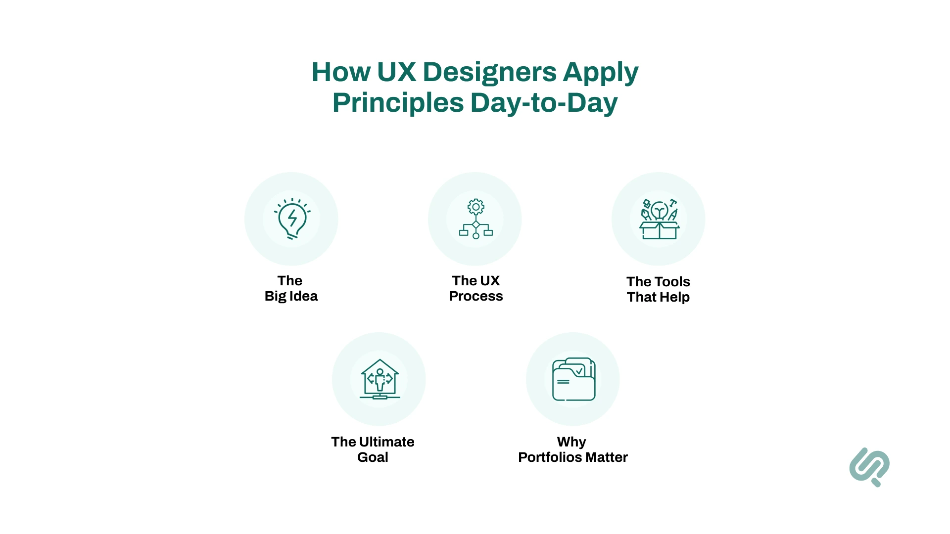
It’s easy to talk about UX design principles in theory. But the real magic happens when UX designers bring these principles to life in their daily work.
Behind every smooth user experience is a series of thoughtful decisions, small details, and plenty of testing. Designers spend their days thinking about how people move through a product, where they might feel stuck, and how to help them feel in control and confident.
The process often starts with user research. Designers talk to real users to discover pain points, habits, and expectations. They look for patterns and listen for clues about how people think, what words they use, and how their mental models shape the way they approach digital tasks.
Understanding users’ existing knowledge and emotions helps designers create solutions that feel familiar and natural, rather than forcing people to learn a whole new system.
From there, designers sketch ideas and map the user flow, using wireframes and mockups to explore layouts while considering visual hierarchy and cognitive load.
They test designs with prototyping tools and gather feedback from teammates or stakeholders. It’s a creative yet logical process, balancing beautiful visual design with practical user needs.
Tools play a huge role in making this work possible. Many designers rely on UX design software to build prototypes, test interactions, and share their vision with others. Prototyping tools help them check how ideas feel in action, long before developers start writing code.
Seeing a design in motion can reveal problems that static images never would, helping teams spot issues like confusing navigation or unclear system status messages early in the design process.
Another key part of the job is building and maintaining a strong UX design portfolio. This isn’t just for job hunting; it’s a way for designers to document how they solved problems, what choices they made, and how they applied design principles to create successful solutions.
A great example of projects that you can add in your UX design portfolio includes managing the UX of projects such as Command and Control Center design and Esports platform designs.
All of this work connects back to the goal of creating user-centered experiences that feel smooth, helpful, and enjoyable.
Good design isn’t magic; it’s the result of testing, learning, and caring deeply about how people think and feel when using digital products.
Even the best UX designers slip up sometimes. It’s easy to get excited about new features or creative ideas and forget the core UX design principles that help create great user experiences.
Avoiding common pitfalls is key to building user-centered products that feel smooth, helpful, and easy to use.
Here’s a quick look at some frequent mistakes and how to fix them:
Small mistakes can quickly overwhelm users and turn an otherwise great product into a frustrating experience. But when you stick to solid UX principles, you help users feel confident, supported, and in control.
Good design isn’t just about creativity; it’s about solving problems and making life easier for people.
UX design principles keep evolving as technology and user expectations change.
What worked five years ago might feel outdated today. To stay ahead and create great user experiences, designers must keep an eye on what’s next.
Here’s a look at the trends shaping the future of user experience and user-interface design:
Let’s discuss these in detail now.
AI is transforming how designers work and how users interact with products.
We’re seeing tools that help create layouts, analyze user feedback, and predict the best user flows.
This means UX designers need to focus on building trust and transparency into AI-driven interfaces. Keeping users informed about system status and decisions made by AI will be crucial.
Users now expect digital products to know them and adapt in real time.
Personalization based on user needs, location, habits, or even mood is becoming the norm.
This trend requires balancing personalization with privacy. Designers must make sure users feel in control and avoid overwhelming them with too much information or too many options, keeping cognitive load low.
Designers are moving beyond function to create products that connect emotionally.
Colors, micro-interactions, animations, and even wording can evoke feelings of delight, trust, or excitement.
Designing for emotion can turn ordinary digital products into memorable experiences. But it has to stay user-centered, matching users’ mental models and avoiding flashy elements that don’t add value.
These trends remind us that UX principles aren’t fixed rules; they’re living practices that adapt to new technology, new contexts, and changing user expectations.
Designers who embrace these shifts will have a true competitive edge, building products that not only work but resonate deeply with real users.
Great UX design doesn’t happen by accident. It’s built on solid UX design principles that help teams create products people love.
When you maintain consistency, reduce cognitive load, and design for user control, you’re not just improving screens; you’re crafting experiences that feel intuitive and meaningful.
These principles turn complex digital products into simple, joyful tools that fit seamlessly into users’ lives. And that’s how brands earn loyalty and gain a true competitive edge.
Start small. Pick one principle and apply it to your next project.
Test it.
Improve it.
Keep going.
Because in the end, user-centered design isn’t just good practice; it’s how you build products that solve real problems, delight users, and drive business success.


Areesha is a content writer with over 2 years of experience in writing about tech and digital trends. She focuses on topics like AI, remote work, and productivity.
Her blogs have helped startups grow their content reach and improve lead generation. She writes with a focus on clarity, simplicity, and reader value.