


Building A1 DDP - Dubai Silicon Oasis
Industrial Area - 342001 -
Dubai - United Arab Emirates
+971 50 756 2346


SERVICES

COMPANY LINKS
SIGN-UP
For Newsletter


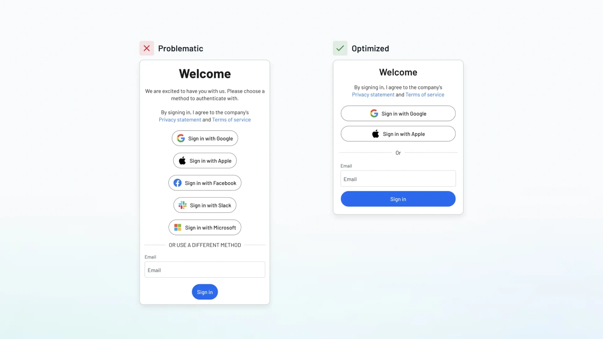
You’re here because something feels off.
Maybe your product interface design looks great, but users aren’t converting. Or your team keeps debating layout decisions, yet no one knows why something works (or doesn’t).
And the proof is clear: a well-designed user interface can boost conversions by up to 200% (1).
Now, let’s explore the key UI design principles that drive clarity, trust, and growth, starting with the ones you can’t afford to get wrong.That’s where understanding UI design principles changes the game. These aren’t just theories for designers. They’re strategic tools to help you reduce cognitive load, guide users smoothly, and create user-friendly digital products that perform.
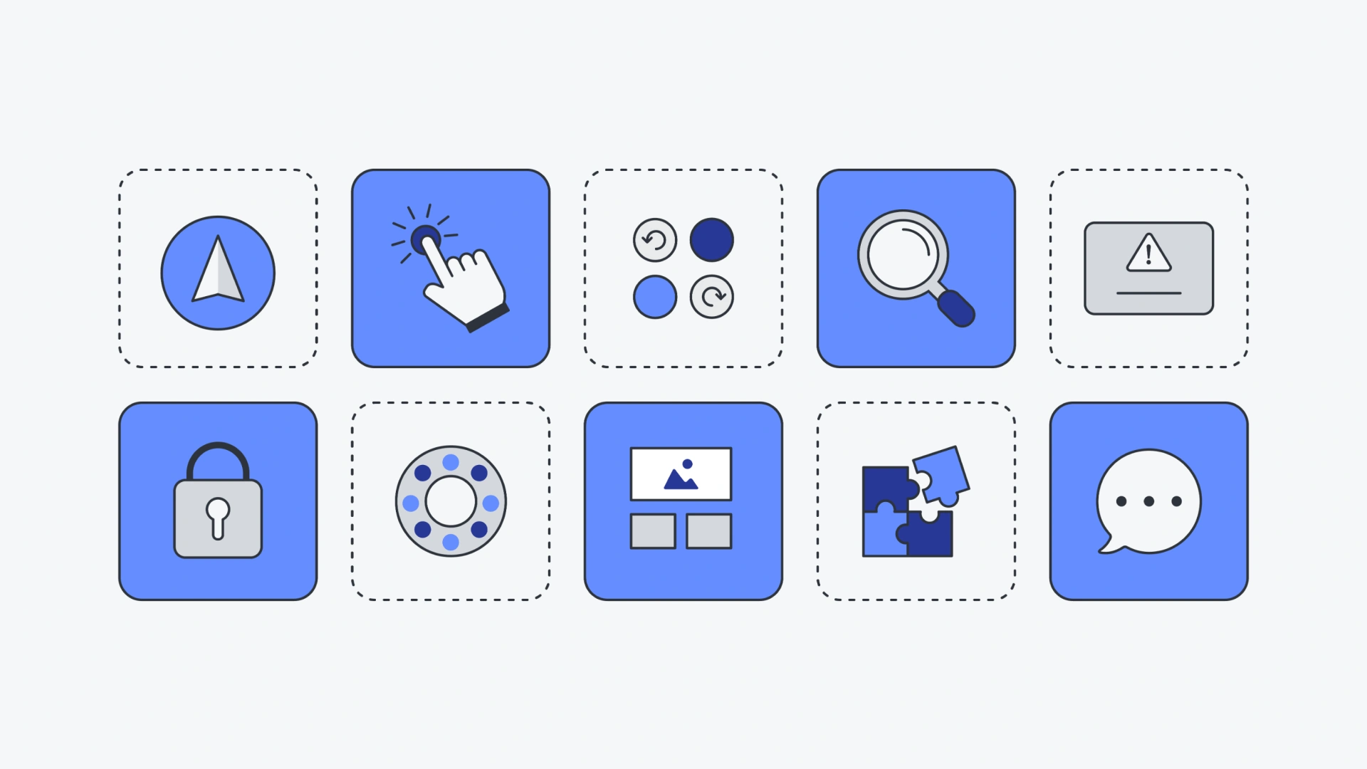
Before we break them down, here’s a quick look at each design principle and what it helps you achieve:
Let’s walk through each one simply, clearly, and with practical examples.
Good UI design helps users focus. People scan pages fast. If they can’t find what they need in a few seconds, they bounce.
That’s where visual hierarchy comes in.
It helps people navigate easily by making important content stand out. You do this with:
Example: On an online store, the “Add to Cart” button is big, bold, and bright. It tells users exactly what to do next.
A well-designed user interface guides users like a signpost, not a maze.
Users feel confident when the interface behaves the way they expect.
That’s why consistency is a basic principle of good ui design. It creates trust and makes your product easier to learn.
Keep these things consistent:
Familiar design patterns (like a hamburger menu or a magnifying glass for search) help users navigate easily without thinking.
Example: Every Google app has the same top bar, side menu, and icon style. Once you learn one, you can use the others easily.
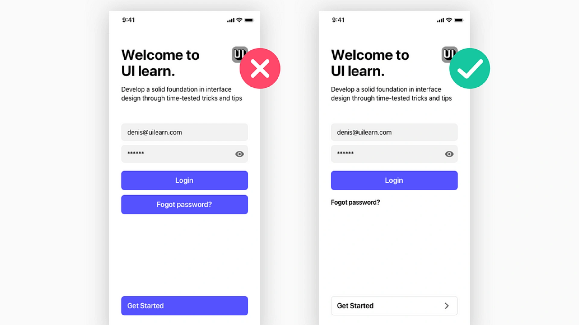
A clean interface speaks louder than a cluttered one.
Clarity means using design elements that are easy to recognize. Simplicity means removing anything that isn’t necessary.
Keep your UI clear by:
Example: Google’s homepage. One logo. One search bar. That’s it. No distractions.
When your UI is simple, users can focus on their task, not figuring out how to use your app.
Cognitive load is the amount of mental effort a user needs to spend.
Your job?
Keep it as low as possible.
You can do this by:
Example: A long checkout form split into 3 steps (shipping → payment → review) feels much easier than one huge page.
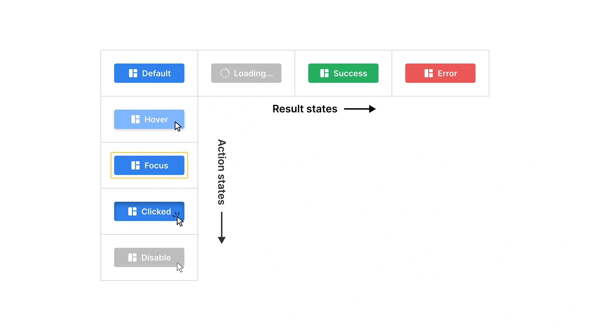
When a user clicks a button or completes an action, the system should respond. That’s called informative feedback.
Without it, people feel lost.
Give feedback with:
Example: A progress bar during file upload. A green checkmark when form submission is successful. A red border appears when a field is invalid.
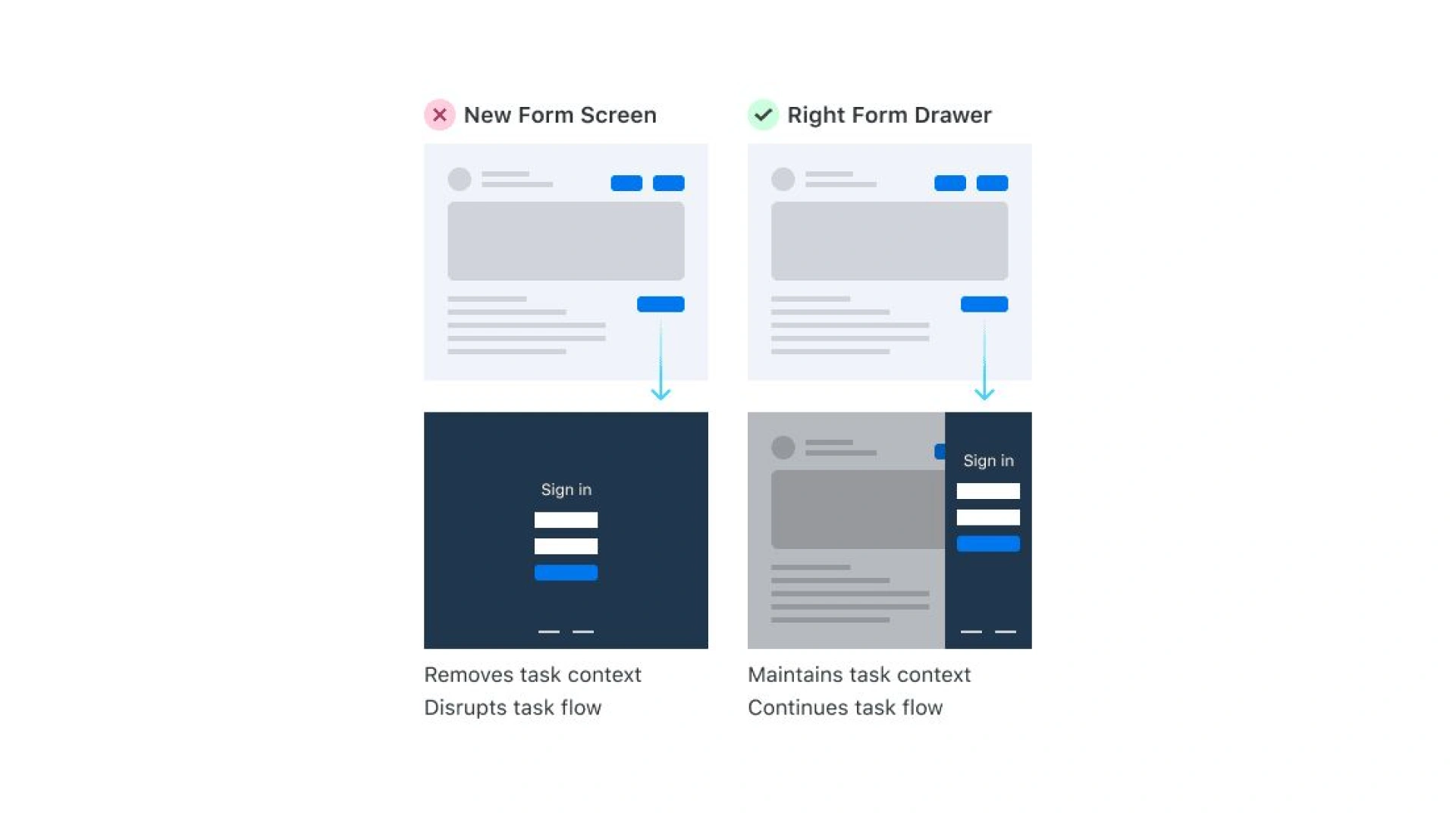
Even the best users make mistakes. Good interface design helps prevent users from making mistakes and helps them recover fast.
You can prevent errors by:
You can support recovery by:
Example: Gmail’s “Undo Send” feature saves lives (and reputations).
A good interface doesn’t trap users. It gives them control.
That means allowing users to undo actions, go back steps, or choose between different ways of doing something.
Support control, and flexibility by:
Example: Slack’s fixed sidebar menu. Users can switch channels any time no back buttons needed.
Not every user sees or interacts in the same way.
That’s why accessible UI design matters. It makes your product usable for people with disabilities, like those with visual impairments, hearing loss, or motor issues.
Design accessibly by:
Example: Zoom’s interface allows for large buttons, high contrast mode, and full keyboard control.
Users jump between phones, tablets, and desktops.
Your user interface should adapt, yes, but it should also feel the same everywhere.
That’s where cross-device consistency becomes a key design principle.
Keep these consistent across platforms:
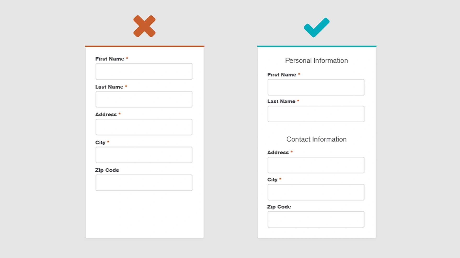
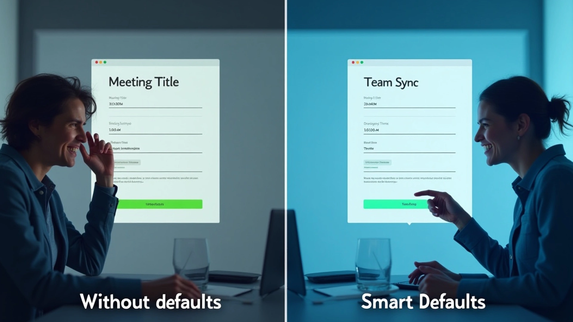
People are busy. Don’t make them start from zero.
Pre-select smart options that match the most common use case. This improves user experience and reduces tedious data entry sequences.
Tips for smart defaults:
New users need help, but not too much.
Good onboarding introduces key parts of the user interface design without overwhelming them.
Tips:
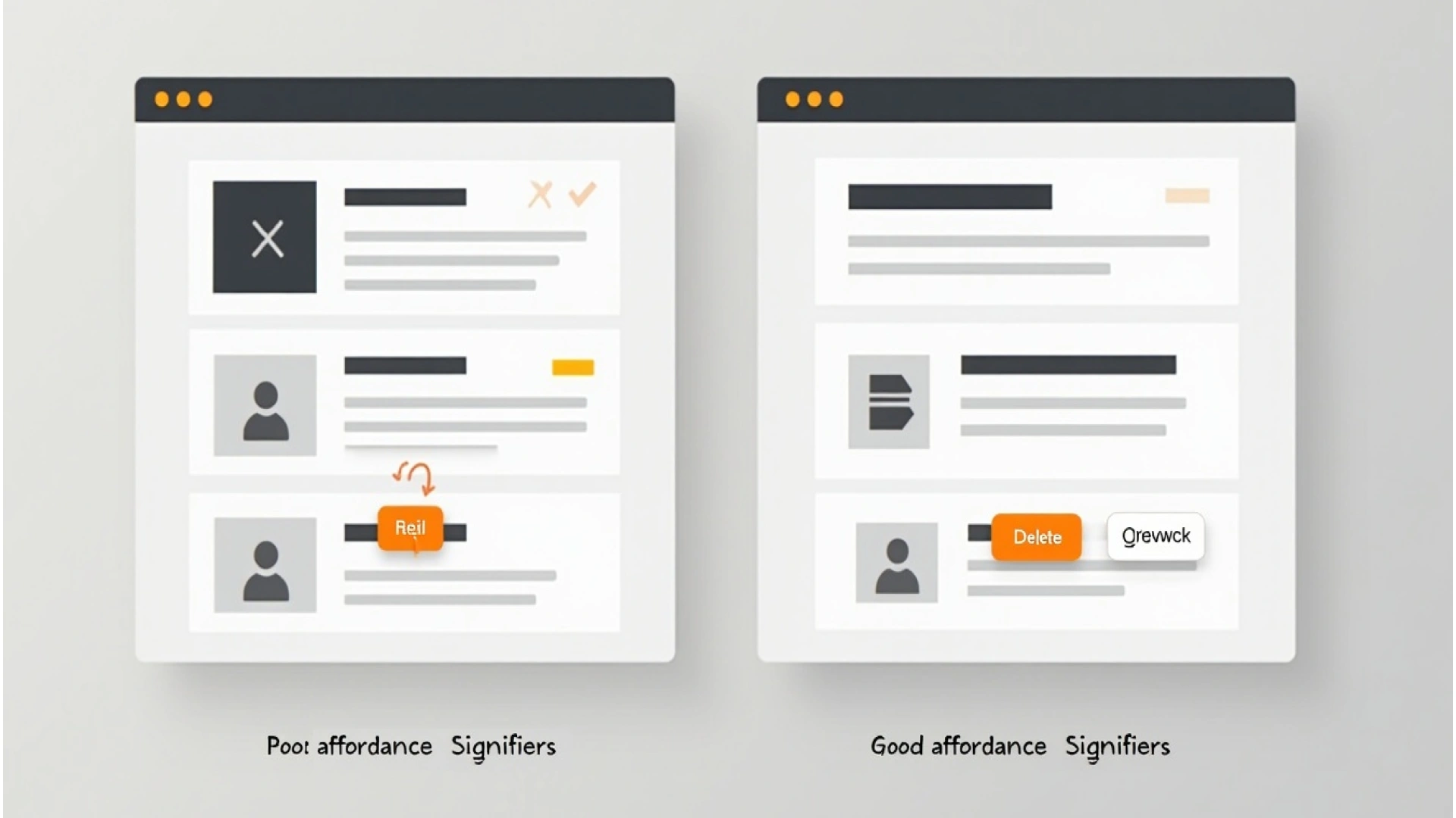
Users shouldn’t guess what’s clickable. They should just know.
This is where affordance (what an element can do) and signifiers (what it looks like it can do) work together.
Use:
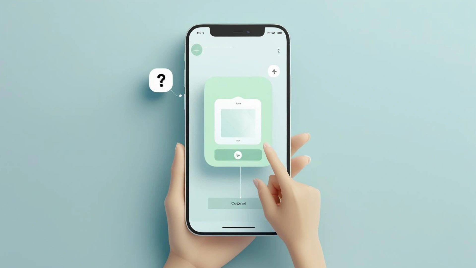
Users shouldn’t feel stuck. But help should come only when they need it.
That’s the power of contextual help and tooltips; they reduce user frustration while keeping the UI clean.
Use them for:
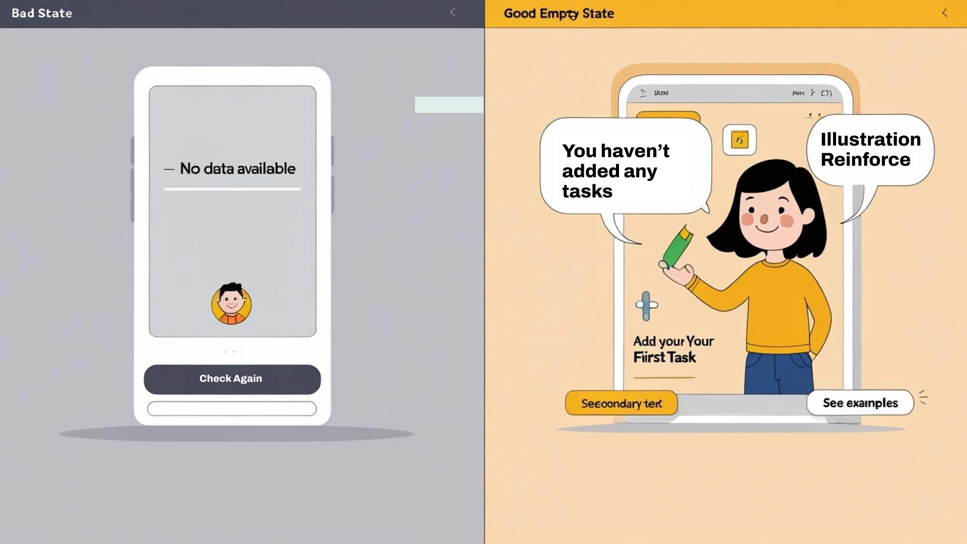
An empty screen is a missed opportunity.
Good UI design uses these blank moments to educate, guide, or inspire users.
Use empty states to:
If users don’t see feedback while waiting, they assume your app is broken.
That’s where loading states, animations, and skeleton screens come in.
Use them to:
Sometimes, the clearest proof of good design isn’t in the theory, it’s in the results.
One standout example is Revolut, a fintech company that improved its digital product by doubling down on ui ux design principles.
In early versions, users complained about unnecessary complexity in core flows like money transfers and bill splitting. The user interface design lacked proper visual hierarchy, and many key actions were buried under generic icons and confusing menus.
Revolut redesigned with a focus on clarity, user expectations, and seamless user experience across all screen sizes.
The results?
By applying basic principles like error prevention, consistent patterns, and simplified flows, Revolut created a functional interface that not only looked great but truly helped users.
These changes aligned Revolut’s UI with basic usability design principles, immediately making the app feel cleaner, faster, and more intuitive.
User testing on these updates showed fewer user errors, quicker task completion, and a more engaging user experience. It’s proof that well-designed user interfaces aren’t just visually pleasing, they perform.
And this isn’t just a one-off win. Research shows that investing in a better user interface can raise your website’s conversion rate by up to 200%, and visit-to-lead conversion rates can be more than 400% higher on sites with a superior user experience. (2)
This is what happens when you put UI design principles into practice.
Here’s how a well-designed user interface stacks up against one that misses the mark. Notice how the differences directly impact user engagement, satisfaction, and business results.
Use it to audit your product interface design, or as a guide during ui ux design process reviews.
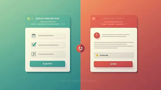
Even the best ui design principles can’t guarantee everything will go right. But great user interfaces plan for when things go wrong, and turn frustration into clarity.
A well-designed interface doesn’t just highlight errors. It helps users recover without stress. That’s the real difference between a good product and a great one.
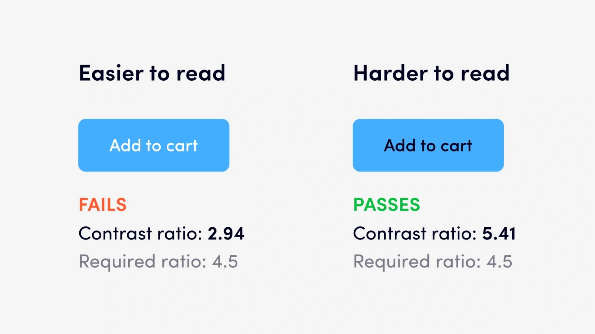
When a form fails or a payment doesn’t go through, users need more than just a red alert.
They need informative feedback.
Something clear.
Friendly.
Helpful.
Messages like “Something went wrong” don’t cut it.
Show users what to fix, where to fix it, and how to move forward.
Smart interface design also prevents issues before they happen.
These small touches reduce user errors, save time, and make the interface feel intelligent.
Error flows aren’t just about recovery. They’re about user trust.
And trust comes from knowing the product won’t punish you for making a mistake. It will guide you calmly, clearly, and respectfully.
This is where cognitive load matters too. When users are already frustrated, the last thing they need is confusion. A clean layout, color-coded messages, and intuitive icons can go a long way in reducing stress.
From 404 pages to form validation, every edge case is an opportunity to show users you’ve thought things through. And when you do, you stand out not just as a product, but as a brand that understands people.
Once you’ve nailed the basic principles, it’s time to go deeper.
Here are six smart UI ideas that make your designs go from good to great:
Let’s look at each one.
If you show too many options at once, you overwhelm people.
That’s why progressive disclosure matters. It helps minimize cognitive load by only showing advanced settings or extra filters when needed.
Use it for:
Our brains naturally group things that are close together or look alike.
This is called the Gestalt design principle. It helps guide users by showing what’s related and what isn’t.
Apply it by:
These are small movements or visual changes that react to the user.
They’re not just pretty, they provide informative feedback in real time.
Result: A more engaging user experience and better feedback mechanisms.
Examples:
Use animation to:
Too much motion can cause distraction or accessibility issues. So, don’t overdo it.
Let’s face it: users judge interfaces by looks before function.
That’s why your graphic design, color scheme, typography, and spacing matter just as much as functionality.
Use:
You can’t guess your way to a great design.
That’s why user testing and prototyping are key steps in any ui ux design process.
Tools you can use:
What to test:
Result: You fix problems before they go live. That saves time, money, and frustration.
Want to get better fast? Study real interfaces.
Look at how top products solve common problems.
Try this:
You’ll quickly notice what works and why.
Result: A deeper understanding of user expectations and how to meet them.
Mastering these advanced UI insights sets you apart from the average product team.
But great design isn’t just about principles, it’s also about flexibility.
Next, let’s look at how to design interfaces that adapt beautifully across different devices and screen sizes.
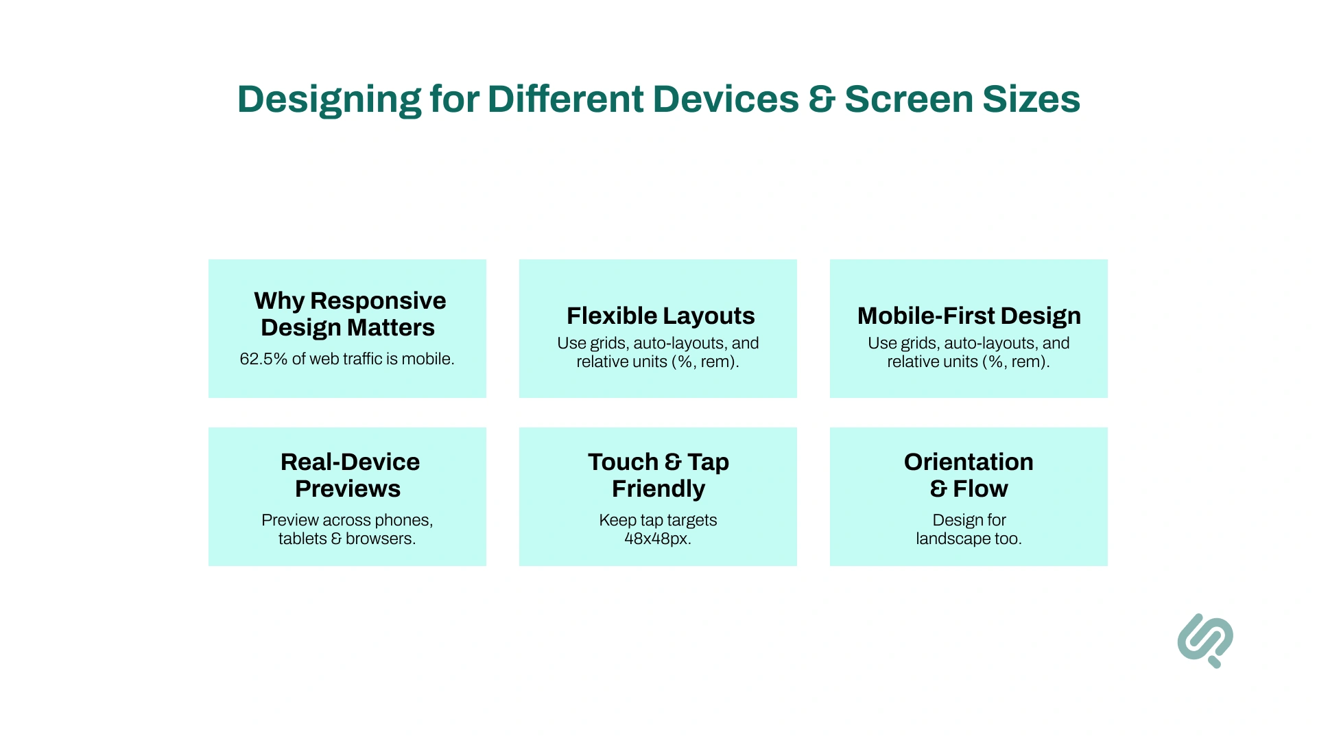
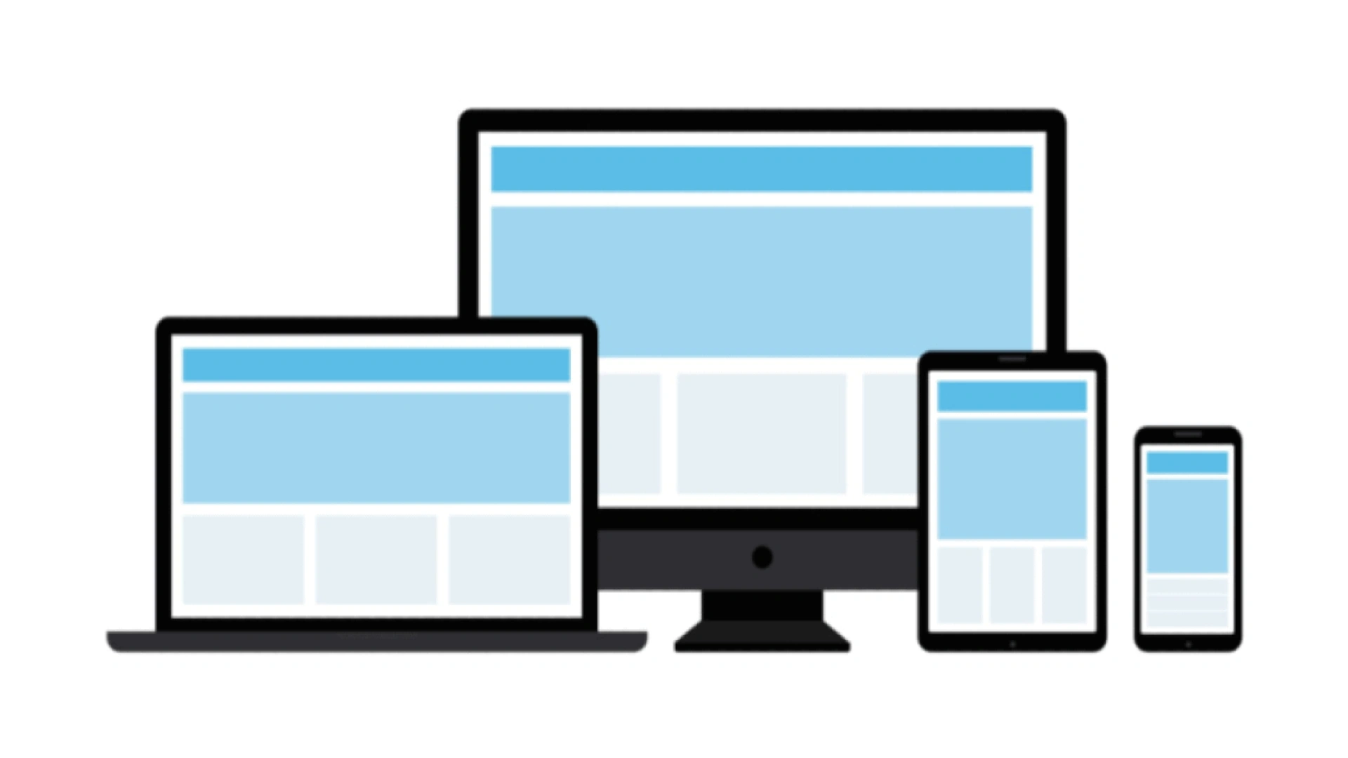
People don’t just use desktops anymore. They’re using phones, tablets, laptops, TVs… even smartwatches.
So your user interface must adapt.
A well-designed user interface should look great and work smoothly on all screen sizes, not just one.
Here’s an overview of what we’ll cover in this section;
Over 62.54% of web traffic now comes from mobile devices (3). That means more than half of your users might never touch your desktop UI.
If your interface doesn’t scale? You’ll lose them.
User expectations today demand a seamless user experience across devices. A functional interface on mobile is not optional; it’s a requirement.
Your layout needs to stretch, shrink, and shift depending on screen size.
Tips for flexible design:
Mobile-first design means starting with the smallest screen first.
Why?
It forces you to focus on what really matters: key features, clear text, and essential actions.
Then you add enhancements for tablets or desktops. This approach also helps minimize complexity.
Example: A music app shows just the play controls and title on mobile. On desktop, you get lyrics, waveform, and queue, layered, not cramped.
Don’t guess how your UI will look.
Test it.
Use tools like:
Try your product interface design in both portrait and landscape. Test weird screen sizes too: foldables, tablets, and even old phones.
People use fingers, not cursors, on mobile. And fingers are bigger than you think.
Follow these rules:
Don’t forget about landscape mode. Some users flip their phones, especially for video, games, or forms.
Tips:
Example: Netflix shifts from vertical browsing to horizontal carousel in landscape mode. Smart, fluid, and optimized for context.
In short, responsive interface design isn’t about one perfect layout.
It’s about building flexible, user-first designs that adapt to various devices and situations, and feel natural everywhere.
Great ui design isn’t about luck.
It’s about clarity, consistency, and designing with your user in mind.
Whether you're building a product from scratch or improving an existing user interface, these UI design principles will help you reduce cognitive load, prevent confusion, and create positive user experiences across devices.
Start simple. Test often. Listen to user feedback.
And always design in a way that helps users navigate easily and stay in control.
Because a well-designed interface isn’t just good design, it’s good business.Using short labels and plain language


Areesha is a content writer with over 2 years of experience in writing about tech and digital trends. She focuses on topics like AI, remote work, and productivity.
Her blogs have helped startups grow their content reach and improve lead generation. She writes with a focus on clarity, simplicity, and reader value.